
Hi, again, gang! Here's the second tut for you to play with. It's been fun to tag after all the scrapping. A nice break that I hope I'm not alone in enjoying. And a good reason to stay inside this very hot weekend! ;)
As usual, let's dispense with the boring stuff straightaway. This tutorial is my own creation and is registered with Tutorial Writers, Inc.. Please do not pass it around by email or re-post it on any forum. You may, however, share the link to the blog or the tutorial page directly. I'd be most pleased if you did so. :)
Also as usual, I've made two versions of this tag, one on a white background (at the bottom of the tutorial) and one on black, to match here. They're identical this time. Yay! Though I'm annoyed to see Blogger is up to its usual tricks and there are extra pixels floating around my tags that don't exist in the originals. Grrr!! No other disclaimers to report, except maybe this tag is slightly labor intensive. Not in a complicated way, we'll just need to fashion two new zippers from the zipper I've included for you in the Blue Jean Baby add-on. Again, it's not going to be difficult, you'll just need time and a little patience. :)
As for what else you'll need, PSP and Animation Shop, of course. The lovely lady is the terrific toonage of Mark Wasyl. You can find the tube and license to use it at CILM. The Blue Jean Baby scrap kit is from yours truly and is available at Sophisti-Scraps. The add-on portion is here at the blog, under the label Freebies. The mask is WSL Mask 134 from the amazing Chelle of WeeScotsLass.co.uk. Thank you, Chelle! Place it into your Masks folder. I'm also using the font Bountiful for my name. And, for the sparkle, I'm incorporating the Bright Noise filter from DSB Flux, but you can always use PSP's Noise (or any other sparkle method) if you prefer.
Okay, then, let's rock and roll! Remember to save often along the way. :)
Open a new canvas, 800 x 800. You can fill the background with the color of your choice in the New Image dialog by unchecking "Transparent," then clicking the Color box and choosing a color, or flood-filling after the image is open. Next, open Frame-01 from Blue Jean Baby. Copy/paste or drag-n-drop to your canvas. Drag-n-dropping has been explained and diagrammed in my Lavenderlicious tutorial. Basically, all you have to do is highlight the layer you want in your palette, then left-click again and "drag" the layer from the palette over to your new canvas. Release the mouse to "drop" it. Easy!
Open your tube image. We'll need both closeup and full-body layers. I can't remember now if this tube was in one of the "transparent" packs. If the closeup layer is semi-transparent even at 100% opacity, simply duplicate the closeup layer until the intensity of multiple copies results in an opaque image. When you have enough copies to achieve the opacity you desire, shut-off the full-body layer and Merge Visible. Now you'll have two fully opaque image layers to worth with . . . if you don't already, and I have my packs mixed up! ;)
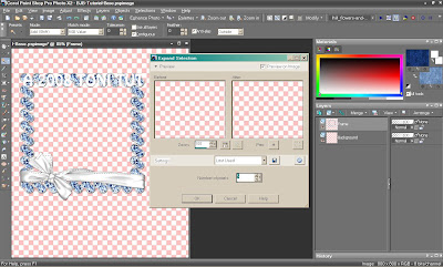
Copy/paste or drag-n-drop the closeup layer first. Position in your palette so it's on top of Background and underneath the frame, then go to Image >> Mirror and slide her over to the left. Don't worry about exact positoning just yet. In fact, turn off the closeup layer for a moment. If you're working on a white background, you should probably turn that off too, so it won't compete with the white wrap. Make your frame layer active. Grab your Magic Wand and click somewhere inside the transparent area of the frame. Click again between the left corner of the frame and the bow to get that little space. If you reallllly wanna cover alllll the bases (mental eye roll LOL!), click inside the teeny weeny spaces at the bottom between frame and wrap. Now go to Selections >> Modify >> Expand and do it by 5 pixels, like this:
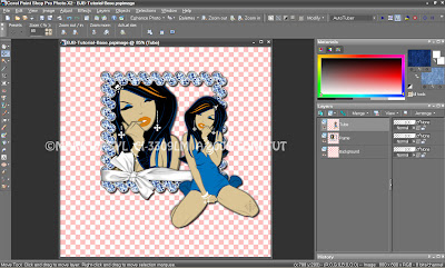
Turn your closeup layer back on. Arrange her inside the frame so her "chop top" is covered and she's still over on the left. Then go to Selections >> Invert to change the selection from inside the frame to everything outside of it. Hit Delete on your keyboard to neatly erase any parts of the closeup that are outside of the frame. Select None / de-select. Give the closeup layer and the frame a drop shadow of choice. Make the frame your active layer and Merge Down. Rename this layer "Frame." Copy/paste or drag-n-drop the full-body tube layer above Frame in your palette. Rename this layer "Tube." Place her on the right side of the frame and give a drop shadow of choice. Close your original tube image and give your working image a save. Here's what we have now:
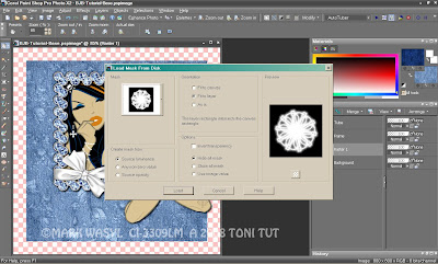
Open Paper-01 from Blue Jean Baby. Copy/paste or drag-n-drop to your canvas. Go to Layers >> Load/Save Mask >> Load Mask From Disk. Navigate to WSL Mask 134. Source Luminance and Fit to Layer should be checked. Check either Hide All Mask or Show All Mask and click OK.
Now Merge Group to flatten the mask into one layer. Rename this layer "Mask." Using your Move Tool, center it behind the frame, but don't go too high. Like this:
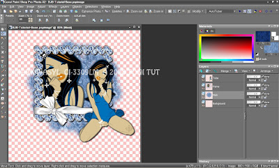
The mask is semi-transparent in random places. I duplicated Mask to increase the intensity, then Merged Down from the copy layer to consolidate it back into one layer. Save your image again. Time to begin Operation Zipper Factory! ;)
Open the zipper of your choosing from the Blue Jean Baby add-on. I'm using Zipper-04. Zipper-01 has the same pattern as the paper we just used, but I wanted a little bit of contrast. Copy/paste or drag-n-drop to your canvas, underneath Tube and on top of Frame. Rename this layer "Zipper 2." I know it's only our first zipper, but it's actually going to be the zipper in the second frame in its "as-is" form. We're going to make two new zippers to start and end the animation. I tried to use the Warp Brush, Mesh Warp and every other deformation tool I could think of to manually straighten the zipper, but it just looked horrible. I was even tempted to whip up a straight one, but I didn't think that would be very tut-worthy . . . or fair! Hehe! So we're gonna do some surgery on Zipper 2 and hack it to bits instead. ;)
Arrange Zipper 2 so the top of the zipper is slightly above the top of Mask, centered, and in the place you want it. Duplicate Zipper 2 twice. Rename one copy "Zipper Parts" and the other "Zipper 1." See how my crazy mind works? ;)
Let's make the pulls for the extra zippers first. Take your selection tool (located with the Magic Wand) and set it to Rectangle, if not there already. Isolate the zipper pull as best as you can, as it isn't perfectly straight, like this:
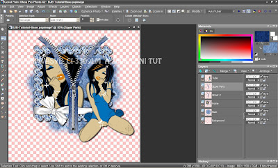
You can also use the Lasso Tool (aka Freehand Selection, also with the Magic Wand) to draw around the pull, as well. Copy your selection, however you've made it, and paste it as a new layer. Rename this layer "Zipper Pull," then Select None / de-select. The pull will need some "cleaning" to remove any extra material or stray pixels. Drag it off to the side of your canvas so you can see. Zoom in (way in! LOL!), then use your Eraser Tool to erase, or any of your selection tools to select and delete. You can also use the Clone Tool to flesh out the bottom part a little bit if you want, but we don't want it to look too far off from the original. Drag it back over one of the colored parts in your tag to check your handiwork. Here's a zoomed approximation of what your pull should look like now:
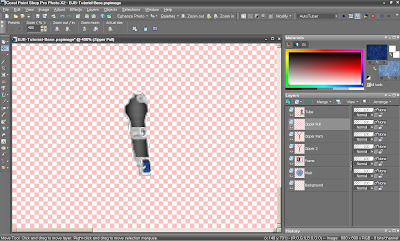
Duplicate this layer and hide / shut-off the copy. Actually, you may want to shut off all your layers, except Zipper 1, which we're about to make, so it will be easier to see. Activate Zipper 1 in your palette and the rectangular Selection Tool again. Select everything from the bottom of the pull up, like this:
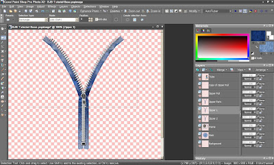
Hit the Delete key on your keyboard to remove those parts of the zipper. Select None / de-select. Now, using the Selection Tool again, select everything except the bottom square of the zipper, like this:
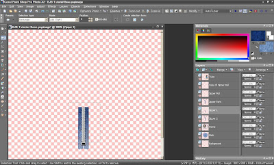
Copy the selection and paste as a new layer. Select None / de-select. Move the copy up so it connects with the previous layer. If you're also using Zipper-04, you'll notice the dark and light parts of the zipper aren't connecting seamlessly. I'm going to Image >> Flip the copy to easily correct that. Slide it up again and it should be spot-on, like this:
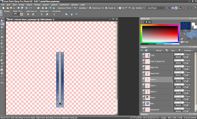
Now Merge Down to combine these two layers. Duplicate the merged layer, then Image >> Flip the copy once again. Turn on Zipper 2. Align the newly flipped layer so the top part is even with Zipper 2. Merge Down once more to combine the zipper. If the colors aren't flowing seamlessly again, use your Clone Tool (turn down the Hardness and Density to 50 first) to blur them a little. Open one of your Zipper Pull layers and affix it to the top square of the zipper. Give the pull a drop shadow. Merge the zipper pull to the rest of the zipper and, if necessary, rename the layer to "Zipper 1" again. Here's mine:
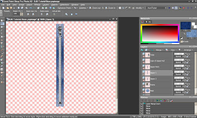
Save your image so you won't have to do that again! ;) Turn off Zipper 1. Now it's time for Zipper 3. We can just use the Zipper Parts layer and rename it when we're finished. Using your Selection Tool or the Lasso / Freehand Selection Tool, select around the left part of the zipper, like this:
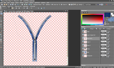
Copy and paste as a new layer. Use the Pick Tool (located with the Move Tool; known as Warp or Deform in earlier versions) to move the layer down your canvas, towards the bottom of the zipper, and rotate to a more natural angle, like this:
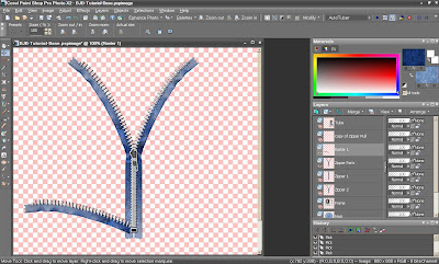
Duplicate the layer and Image >> Mirror the copy. Slide the right copy layer back over and arrange to match the left. Grab your remaining Zipper Pull layer and move it over the bottom square of the zipper, on top of the two sides. Give the pull a drop shadow. Now, similiarly to how we deleted the top of the original zipper, we're going to do the same thing on the Zipper Parts layer. Using the Selection Tool of your choice, select the parts of the zipper we won't be needing, like this:
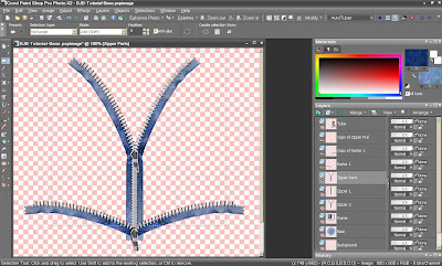
Hit the Delete key on your Keyboard and wave bye-bye. LOL! Merge Visible to consolidate, rename the layer to "Zipper 3." If necessary, Clone again to blur any harsh lines between the blues in the zipper. Turn all three zippers back on to verify that all three are perfectly lined up. Don't move them from here on out unless you link them first. Layer linking has also been explained and diagrammed in my Lavenderlicious tutorial.
See the numbers and sliders on the right of your layer palette? If you don't see them, your left half of the layer palette is extended all the way over. Look to the right and grab the little slider icon on the right border. Simply slide it back to the left until you see the sliders on the right. You can also grab the left side of any palette and extend towards your workspace, as well. To keep a series of layers together, simply click the word "None" and assign a number. PSP will count from 1 on up automatically. In this tag, you'd give Zipper 1 a 1. Then highlight Zipper 2 and give it a 1, too. Same for Zipper 3. If you want to keep several different layer items grouped, give each a different number. The zippers are 1, all the frames 2, tubes 3, and so on. Resetting a layer back to None simply means it's back to being on its own if you were to move it, i.e. none of the other layers will "follow."
You can also link dissimiliar item layers if you want to move them simultaneously, which can be helpful if you want to keep spacing or other effects proportionate. However you use it, it's a nifty and important tool when it comes to arranging animated tags, so you won't have anything "jumping." Well, that shouldn't be, anyway! ;)
Give all three zippers a light drop shadow. Use the Control + Y keyboard shortcut to repeat the same shadow on the second two layers. Save your image and give yourself a pat on the back. Yay!! You did it! We're not quite done yet, but I daresay the hardest part is over. :)
Make Frame visible and your active layer. Duplicate it once, for now. Rename the copy layer "Frame 2." Close Zippers 1 and 3. Activate your Freehand Selection / Lasso tool and place it in Add mode. Using Zipper 2 as your guide, draw around the parts of the frame we won't need, like this:
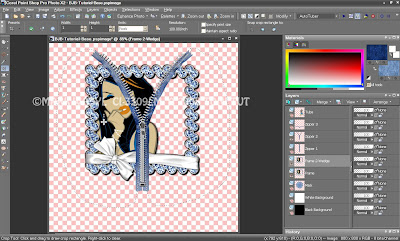
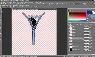
Hit the Delete key on your keyboard to remove the extraneous parts of the frame. Select None / de-select. Here's what it looks like now:
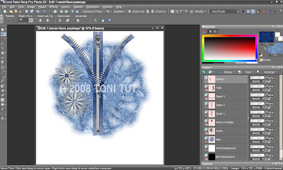
The last thing we need to adorn is what will be the first frame witih the closed zipper. I've added Flower-05 and Flower-06 from the main Blue Jean Baby kit. I resized, put them over on the left, gave them a light drop shadow, then Merged Down from the top flower and renamed the consolidated layer "Flowers." Be careful the flowers don't go any higher than Zipper 2, or they won't "wipe away" properly when the zipper opens during animation. Using Zipper 2 as your guide again, your canvas would look something like this:
Now it's time to add our name. I'm using Paper-01 from Blue Jean Baby as the Background / Fill and Paper-02 as the Foreground / Stroke. Drop them into your Patterns folder, or open them in your workspace, minimize to get them out of the way, then select them as your respective patterns from the Color palette. Again, the font I'm using is called Bountiful, and you can grab it at the link above. I rotated my text slightly so it fits better around the tube's knees. Give your text a drop shadow of choice. Rename this layer "Name," or your name, whichever you prefer.
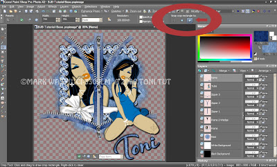
Turn all of your layers back on, except the background layer. Activate your Crop Tool and choose Merged Opaque, the box on the right in your toolbar, as I've shown you below. The crop is more precise if you let PSP do it for you. If you leave the background layers on, though, it will include those pixels, leaving you back at square one again. ;) Click the green checkmark at the left side of the toolbar to accept the crop. Turn your background layer back on. Might as well save it while you're at it, too.
I think I'm going to do my sparkling before I resize and add the copyright. No particular reason, except it's just easier to see! LOL! As I mentioned above, I'm using DSB Bright Noise to accomplish that. Constellation, VM Sparkle, Xero, PSP Noise and/or sparkle tubes are all just fine. Nor do you have to sparkle if you don't want to. You can just catch up with me when we get to AniShop if you prefer. In fact, I almost didn't sparkle the tag at all because of the inconsistent timing it requires, but I've thought of a way to minimize the damage. Yep, I'm making you guys work hard today! ;)
Our tag will have 8 frames when it's finished, but we're going to build it like it will have 6, i.e. in sets of three. I'm sparkling the mask, the jewelry on both tubes, the frame, the flowers, and my name. First, the name. Take your Magic Wand and put it into Add mode, Tolerance 55. Select your name, trying not to select the drop shadow pixels. When selected, duplicate your layer twice, for a total of three Name layers. Apply DSB Bright Noise (or PSP's noise) to each layer. If PSP noise, adjust the numeric amount of noise up or down on each layer to give it "motion." Random has the largest or coarsest pixel size, Gaussian and Uniform a little finer. Use the one you think looks best.
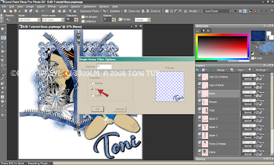
If DSB Bright Noise, click the word for the type of noise you're using once or twice before applying to the next layer. That will mix the noise without having to reduce or increase it. You'll see it "jump" in the little preview window. "Mix" is a medium blend of whatever the object color, "Darker" will darken with black, "Lighter" noise will brighten with white. The higher you adjust the amount of Lighter noise, the "whiter" it will become; the "blacker" Darker will become. I'm using Mix noise on everything today, except the flowers, on which I used Lighter noise. I turned the slider down to around 35 so it wouldn't be "too" white. Use the picture below as a guide where to place your mouse for the mixing click:
Make two copies of each layer item you wish to sparkle and do all three as described, EXCEPT Frame. Don't copy Frame 2 at all; we only need one of those lil' wedges. On the original Frame layer, duplicate three times for a total of four. Use your Magic Wand to select the closeup's jewelry (zoom in if you need to) and the blue gemstones of the frame. Sparkle all four and your Frame 2 wedge. And allow me to explain the extra layer. :)
Theoretically, we could get this tag done in a minimum of three frames. Zipper closed, zipper halfway open, zipper all the way open. But, we're also going to zip back up, which adds a minimum of one more frame. Then we have to figure in the timing, For sparkle to animate in the most blingalicious and seamless way possible, it's usually best to have frames with equal timing set somewhere between 15 and 25, though all is fine even if you need to extend the timing somewhat. However, in this tag, if we set it that way, it will play much too fast, even with additional timing length. We want a strategic pause at both the beginning and the end of the animation, and we also want the zipper to look smooth, all without losing the sparkle. (Can we have a Rolls Royce while we're at it? LOL!) So, we're going to take what we could have done in one frame set at 120 or 150, and "break it up" into four frames set at 30 or 40 that are technically the same, but we'll vary with sparkle to keep the effect going, even when the animation appears "still." We'll also do that on the tail end, so we can extend the pause when the animation replays without losing the sparkle effect there, either.
Now that you know the method behind the madness, it's time to resize and add your artist copyright. The reason adding the copyright should always be the very last thing you do is so that it won't get distorted during the resizing and will still be legible afterwards. I had a lot of trouble getting pixel (or any small) fonts to be legible in PSP 9 no matter how or when I did it, but all versions since have been fine in that department. Thank goodness! I'd been spending the most time on the smallest and most annoying part of the tag ;) I've since uninstalled all but X2. And I'm digressing. Back to the tag ranch we go! LOL! Save your image and get your neck brace out. Time to go back and forth from PSP to Ani Shop! ;) Here's what our "completed" canvas looks like:
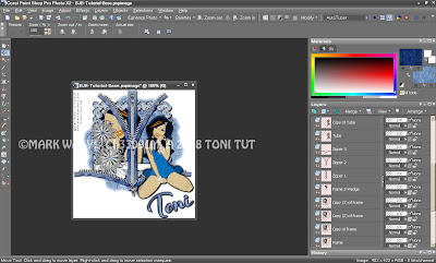
Turn off all layers except Background, Mask, Zipper 1, Tube, Flowers, Name and your copyright. Highlight one of the visible layers in your palette and Copy Merged to AniShop as a New Animation.
Back to PSP. Close Mask, Zipper 1, Tube, Flowers and Name. Leave your Background and Copyright layers on; don't turn them off from here on out, as we need both to appear in all frames. Open Copy of Mask, Zipper 2, Frame 2, Copy of Tube, Copy of Flowers, and Copy of Name. Copy Merged to AniShop and paste After Current Frame.
In PSP again, close Copy of Mask, Zipper 2, Frame 2, Copy of Tube, Copy of Flowers and Copy of Name. Open Copy (2) of Mask, Zipper 3, Frame, Copy (2) of Tube, and Copy (2) of Name. Copy Merged and paste into AniShop After Current Frame. Now you should have three frames; zipper closed, zipper halfway open, zipper all the way open.
Next is the first pause we want to insert, so the zipper stays open and we get to gaze at her lovely mug for an extra couple of beats without losing the sparkle effect. Close Copy (2) of Mask, Frame, Copy (2) of Tube, and Copy (2) of Name. Leave Zipper 3 open, and please don't close it until we've finished Frame 6. Promise to let you know when it's time to shut it off. ;) Now open Mask, Copy of Frame, Tube, and Name. Copy Merged and paste into AniShop After Current Frame.
Back to PSP. Close Mask, Copy of Frame, Tube, and Name. Open Copy of Mask, Copy (2) of Frame, Copy of Tube, and Copy of Name. Copy Merged and paste into AniShop After Current Frame.
In PSP again, close Copy of Mask, Copy (2) of Frame, Copy of Tube, and Copy of Name. Open Copy (2) of Mask, Copy (3) of Frame, Copy (2) of Tube, and Copy (2) of Name. Copy Merged and paste into AniShop After Current Frame. Still in AniShop, highlight / select Frame 2. Copy and paste it after Frame 6, the frame we just did and the last one you should have.
Go back to PSP. Last time! Close Zipper 3 and Copy (3) of Frame. Open Zipper 1 and Copy (2) of Flowers. Copy Merged and paste into AniShop after your last frame, the duplicate of Frame 2. You should now have 8 frames. Whew! ;)
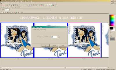
Now that you can see them lined up in AniShop, things probably make a lot more sense, too! LOL! Select Frame 1. Right-click, select Frame Properties. Set the timing of this frame to 45. Select Frame 2. Set the timing to 25. Now select frame 3. Depress the Shift key, arrow over to the right and also select frames 4, 5, and 6. Set their timing to 40. Now click Frame 7 and set its timing to 25. Frame 8 should be at 45. Press play and behold! :)
Annihilate (or Optimize, as they call it! ;) save as a .gif, and you're done! Hope you've enjoyed the tutorial and had fun. And you have a zippy new outfit to wear! ;)





No comments:
Post a Comment