
I've been ignoring my tagging passion far too long since becoming hooked on scrapping. Thought this might be a nice way to bring the two together. :)
This tutorial is my own creation. Any similiarity to any other is completely unintentional. Please do not copy it, upload it to another website or share it via any email or forum groups. You may, however, share the link directly here, to the blog and/or the tutorial page directly. I'd be flattered and very pleased if you liked it enough to do so. I hope to be on the TWI roster within the next couple of weeks.
As for supplies, I'm using my toonish alter-ego (LOL!! Yeah, I know, you don't have to say it. ;), the beautiful art of Jamie Kidd, which you can find at CILM. Please do not use the same tube without purchasing it and receiving the accompanying license. The Lavenderlicious scrap kit is from yours truly and available at Sophisti-Scraps. The mask is WSL Mask 220 from Chelle at http://www.weescotslass.co.uk/. Just drop it into your Masks folder. Gotta say Chelle's masks are absolutely awesome! I have about 5,000 masks, yet hers are the ones I always come back to. Her tuts rock, too! Thanks so much, Chelle! :)
I'm also incorporating the filter/plug-in DSB Flux Bright Noise, though you can use PSP's noise if you prefer. And I shall assume you have a basic understanding of the tools, commands and effects within PSP.
Okay, then. Let's get started! Don't forget to save often along the way. ;)
Open a new canvas, 800 x 800. I like to work big then size down, myself. You can fill the background with the color of your choice in the New Image dialog box by unchecking "Transparent," then clicking the color box that appears. If you forget, just flood fill after the image is open. You can leave it transparent if you prefer, of course, but Animation Shop isn't friendly to transparent .gifs — as the Wink tut proves. Tried to put a black background on after the fact, now it might be even worse! LOL! ;) The Optimizer (or, as I like to call it, "The Annihilator" ;) is even harsher if you've drop-shadowed any of the elements in your tag. There are ways to minimize the effects as best you can if you reallllly have to have a transparent background, but we'll save that tut for another day! ;) I first made this tag with a white background, then with black so it would match the background here. However, the majority of my screen shots will have a transparent canvas. Hope that makes it easier to see. :)
If you would like your tube to wink, please visit my tutorial on how to do that, here. I'm going to assume you've already been there and have a working, winking image with which to proceed. If you don't have or wanna wink, just ignore the parts which pertain to that and copy/paste your tube accordingly.
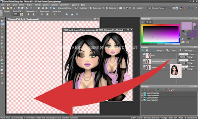
Open your tube and place it alongside your new canvas so you can see both. It's okay if they overlap. Make your tube the active image and activate the "Open Eye" layer in your palette. Place your mouse on the layer name in the palette, left-click and simply drag it over to your new canvas. PSP will "drop" it right into the middle of the canvas. Now go back to the tube, highlight the "Closed Eye" layer in your palette and do the same thing. Both of your tube layers should now be perfectly aligned in the center of your canvas and directly on top of each other, which is what we want in order to avoid "jumping" when it comes time to animate. Cutting an existing layer then pasting it as a new layer will also center it for you. Rename your tube layers so you can easily identify which layer is the open eye and which is closed. Add a drop shadow of choice to both tube layers, being sure to use the same settings on both layers. Selecting the next layer then hitting Ctrl + Y on your keyboard will repeat the last executed function with the same settings. Close your original tube image.
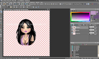
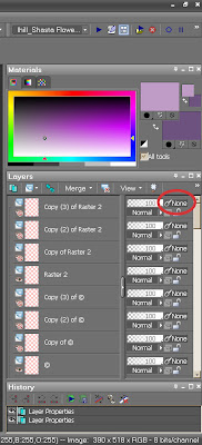
Whatever you do, don't move these tube layers unless you've linked or grouped them first. To do that, go to your layer palette. See the numbers and sliders on the right? If you don't see them, your left half of the layer palette is extended all the way over. Look to the right and grab the little slider icon on the right border. Simply slide it back to the left until you see the sliders on the right. You can also grab the left side and extend the palette towards your workspace, as well.
As for making sure if you move one tube layer you move both, simply click the word "None" and assign it a number. PSP will count from 1 on up automatically. Assign 1 to your top tube layer. Now highlight your bottom tube layer and give it a 1, too. If you want to keep several different layer items grouped, give each a different number. The tubes are 1, all the frames 2, flowers 3, and so on. Resetting a layer back to None simply means it's back to being on its own if you were to move it, i.e. none of the other layers will "follow."
Okay, now that your tubes will be forever on the same page — literally LOL! — open Frame-01 from Lavenderlicious. Copy it to your canvas or drag-n-drop like you did your tube. Rename this layer "Frame." I rotated 90° right to better accommodate the shape of my tube. I resized the frame to 75%, then used the Pick Tool (located with the Move Tool, known as Warp or Deform in earlier versions) to slightly scale down the frame a little further so it fits better around my tube. Use a light drop shadow to give the frame dimension. Sharpen if the stones look dull.
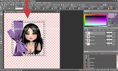
Now we have a basic "foundation" to work with. Next, let's give it a little bit of background color. Open Paper-03 from your Lavenderlicious kit. Copy/paste or drag-n-drop it to your canvas. Drag it in your palette so it's on top of your background layer, underneath your tube layers. Next, select the Layer menu, then Load/Save Mask, then Load Mask from Disk. Navigate to the mask you want to use, being sure it's set to fit layer (which is also the same size as your canvas in this particular case) and that Source Luminance is checked. Again, I'm using WSL Mask 220 from the very talented Chelle. Click OK to load/apply. Now Merge Group and rename this layer "Mask." Use the Move Tool to arrange the mask if it isn't centered behind your frame. Depending upon the background color you're using, you may want to give it the faintest of drop shadow. Too much will be overpowering. ;)
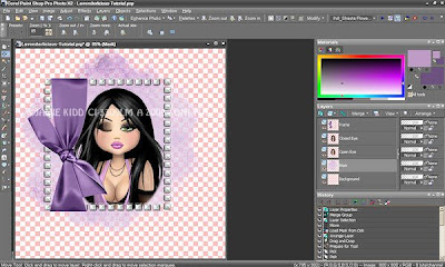
Now it's doodle time. Grab Doodle-02 from Lavenderlicious. Resize to 80%. If you didn't move from the Mask layer, copy/pasting or drag-n-dropping the doodle will put it right above the Mask layer in your palette, which is what we want. Simply drag it there otherwise. Rename this layer "Doodle" and drop shadow to your liking.
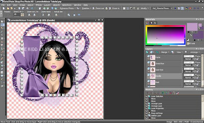
As you can see, there's space around the bottom of my tube where the image border fades. It actually doesn't look too bad that way, but I'd prefer it be covered up, so I decided to adorn with that in mind. I added Lavenderlicious Flower-03 and Flower-04 in the lower right-hand corner, Beads-02 across the bottom (erased the extra length sticking out on the sides), Pin-01 (rotating it and erasing parts of the center to make it look like the pin is going "through" the wrap rather than just sitting on top of it), Bow-02 in the upper left-hand corner and Butterfly-02 upper-right, resizing, drop-shadowing and renaming each layer accordingly. You can do it any way you want to! :)
I'd like to take a moment here to stress the importance of renaming your layers, especially if you plan to animate and need several copies of each layer to comprise your frames. It's tricky trying to figure out which layer is which layer, and which copy you're on, if you haven't taken the time. Hope you'll believe me when I say those extra couple of seconds will really pay off later! :)
Moving on, now you're ready to add your name. I'm using Buffet Script, fill/background color #BE9CC5 and the darker #6D5280 for the foreground/stroke. I have so many fonts I can't remember if this is a pay font, so I'm erring on the side of caution and not sharing it. Give Fonts101.com a look-see if you want it. They seem to have most everything! ;)
If you don't want to animate, crop your tag, then resize as desired, making sure "All Layers" is checked. Add the copyright info for your tube, save as a .jpg and you're done! Hope you've enjoyed the tutorial and had fun. :)
For those who would like to animate, I'd first like to say that this particular ani, the wink, doesn't bode well for adding the most seamless glitter and sparkle, but that doesn't bother me as much as no sparkle at all. So, here we go. ;)
I used DSB Bright Noise to animate everything in this tag, though there certainly other ways to sparkle. For now, decide what elements you want to animate. Let's take the frame, for example. Use your Magic Wand to select the diamonds in the frame. Unchecking "Contiguous" might help to select faster in this case, as might "View Current Only," so other layers won't interfere in what you're trying to isolate. When you have what you want selected, duplicate your layer three times, for a total of four. Apply DSB Bright Noise (or PSP's noise) to each layer.
If you're using PSP noise, adjust the amount of noise up or down on each layer to give it "motion." Random has the largest pixel size, Monochrome and Gaussian a little finer. You may want to experiment to see which works best for the particular element you're working on.
If you're using DSB Bright Noise, click the title word for the type of noise you're using once or twice before applying to the next layer. That will mix the noise without having to reduce or increase the number. You'll see it "jump" in the little preview window. "Mix" is a medium blend of whatever the object color. "Darker" will darken with black, "Lighter" noise will brighten with white. The higher you adjust the amount of Lighter noise, the "whiter" it will become; the "blacker" Darker will become. I used Lighter Noise on the diamond elements but tried not to make it too high. I think somewhere around 30, if I'm not mistaken. Use the red arrow as an example of where you should place your mouse for the mixing.
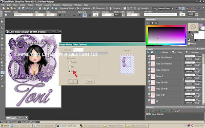
Once you've selected, noised and copied all of the layers you want to animate, make sure to copy any you didn't animate so there are four of those, as well. (Remember, your tube will have two "Eye Open" and two "Eye Closed" layers instead). Now you have several choices how to proceed. If you're going to use this "base" again and may change around the elements, save it unmerged for future use. If you want to use the base "as is" again but only change the name, you can merge your frames (shut off/close/hide all your current name layers first), save it, then add new name layers or copy and paste them via Ani Shop into the "base" tag. Or, you can leave the image as is, and copy/paste each frame into AniShop, saving it unmerged as I mentioned before. I went for the Merge, myself. ;)
Either way, you'll first want to close ALL layers, or View None to save a few clicks. Then open one of each layered item, preferably the same "copy number" of each item so you'll have an easier time keeping things straight. (See why I said the renaming thing was so important? ;) For example, first open Background, Mask, Doodle, Frame, and so on until the "original" layer of every item is open/visible and all other layers are closed.
Highlight the bottom-most layer you're merging, in this case, the background, then Merge Visible (or Copy Merged, paste directly into into AniShop). If you're merging, your highlight will still be on the newly merged layer in your palette. Rename it if you desire, then close it and move your highlight up to the next Background layer, "Copy of Background." Now open "Copy of" all the items in your palette and Merge Visible again, being careful to close/hide the previously merged layer or you'll merge it into the next one. If you mistakenly highlight a closed layer in your palette and attempt to Merge Visible, the option will be grayed out. Do your "Copy Merged/Paste into AniShop" or Merge Visible two more times, on the "Copy (2)s of" and "Copy (3)s of" respectively until you have four frames. If you've copied and pasted to Ani Shop, please feel free to skip the next paragraph.
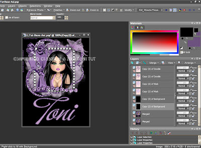
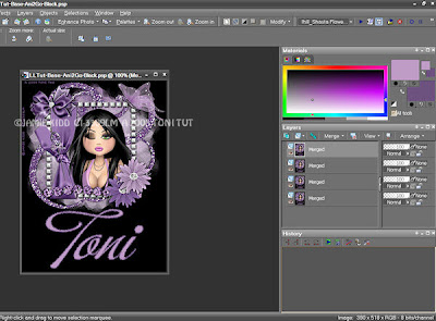
For those of you who've elected to merge, you have two choices. You can save each of your four frames/layers as a separate image, appending or differentiating their names so AniShop can tell them apart, then using the Animation Wizard to build your animation. Or, if you've configured AniShop to accept layers as frames, make sure all four layers in your image are open/visible, save as an Animation Shop .psp file, then simply File/Open in AniShop. Presto, four frames ready for you to play with. ;)
Because it isn't easy trying to integrate the timing of glitter and winking, you really have a multitude of options. You can just play with the timing. You can also add or subtract frames to further hone your desired effect. I added two more frames on my white-background tag so the wink wouldn't seem so fast or often, for a total of six frames, by copying and pasting right in AniShop, trying not to put a duplicated frame next to its original. The black-background tag I left with four frames. My wink frames are set on 20, the rest on 35. Annihilate . . . er, optimize, save as a .gif, and you're done! ;)
I'm sure it will look terrible on the black background, but here's the white one for comparison:

Hope you've enjoyed this tutorial, and the pretty new "outfit" you have! :)





2 comments:
Thank you for this great tut. I didn't do any animation, but I'm thrilled with the result. Your Lavenderlicious kit is gorgeous!Hugs Jacqui
YOU HAVE BEEN TAGGED! lol We love all the awesome freebies and work you all have done! Thank you for sharing! Now on to the rules of being tagged hehehe
You've been tagged!
These are the rules:
1. Link your tagger { http://frostedillusions.blogspot.com/ } and list these rules on your blog.
2. Share 7 facts about yourself on your blog, some random, some weird.
3. Tag 7 people at the end of your post by leaving their names as well as links to their blogs.
4. Let them know they have been tagged by leaving a comment on their blog.
Hehehe enjoy!
Post a Comment