
Hey, gang!
How 'bout a tag to go along with the new kits? Compared to the SOB and BJB tuts, I don't think you'll need to pack a lunch for this one. ;)
As usual, this tutorial is registered with Tutorial Writers, Inc. and is my own creation. Please do not pass it around by email or re-post it on any forum. You may, however, share the link to the blog or the tutorial page directly. I'd be most pleased if you did so. :)
Also as usual, I've made two versions of this tag, one on a white background (at the bottom of the tutorial) and one on black, to match here. The only difference is in the copyright text, as black wasn't legible on the black background. As you can see, there isn't much to this one, just a little maneuvering with the deformation tools, depending upon which version of PSP you're using. I'm using X2, but I'm pretty sure any version will work. You'll need to locate your Warp, Deform or Pick Tool, which is usually found with the Move Tool. And you'll need Animation Shop, of course. ;)
As for other supplies, I'm using the beautiful art of Jamie Kidd, which you can find at CILM. The Aqualectric scrap kit is from yours truly and is available at Sophisti-Scraps. I used the font Riot Squad for my name, the Bright Noise filter from DSB Flux for the sparkle (though you can use PSP's Noise if you prefer) and WSL Mask 105 from the amazing Chelle of WeeScotsLass.co.uk. Place it into your Masks folder, along with the rest of her fabulous collection. Thank you, Chelle, for such a wonderful resource! :)
Alrighty, then. Let's get started! Open a new canvas, 800 x 800. You can fill the background with the color of your choice in the New Image dialog by unchecking "Transparent," then clicking the Color box and choosing a color, or flood-filling after the image is open. Open Paper-01 from Aqualectric and copy/paste or drag-n-drop to your canvas. I've explained and diagrammed drag-n-dropping in several of my tutorials. The short version: left-click the layer you want to move in the layer palette and simply drag it from the palette to the canvas where you want it. You can even drag a layer to the same canvas as a quick way to copy. It's a nifty little trick that's hard to forget once learned. ;)
Now go to Layers >> Load/Save Mask >> Load/Save Mask from Disk. Navigate to WSL Mask 105 via the dropdown window. Source Luminance and Fit to Layer should be checked. Invert Transparency should NOT be checked. Check either Hide All or Show All mask, then click Load. On your Layer palette, right-click any of the layers in the mask group and Merge >> Merge Group. This will consolidate the mask into one layer so it's easier to work with. Rename this layer to "Mask."
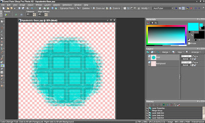
Open Frame-01 from Aqualectric and copy/paste or drag-n-drop to your canvas. Now open your tube. Grab the Layer 3 closeup and copy/paste or drag-n-drop to your canvas. Position underneath the frame layer in your palette. Move her to a spot in the frame of your liking. I liked the way the full-body tube looked "propped" against the side of the frame, so I elected to put the closeup on the right side of the frame, leaving her facing the same way. Not sure why, but I didn't like either of them facing the opposite direction. Anyway . . . LOL! Activate your Selection Tool (located with your Magic Wand) and be sure it's set to Rectangle in the upper toolbar. The Mode should be on Add or Replace. Select mid-way through the stones of the frame, like this:
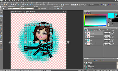
Now go to Selections >> Invert, which will change the selection from inside the rectangle to everything outside of it. Make the closeup layer active in your palette and hit the Delete key on your keyboard. Voila, the extra parts of the closeup tube have disappeared. Normally we'd just use the Magic Wand to select inside of the frame, but the spaces between the stones don't allow for a clean or contained selection.
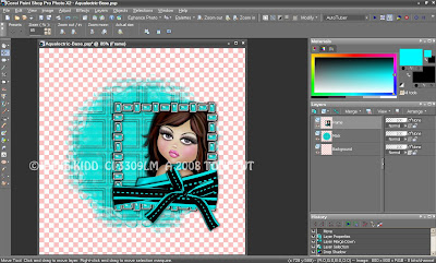
Give your closeup layer a drop shadow and do the same to the frame. From the frame layer, Merge Down in your palette to consolidate the closeup and the frame. Rename this layer to, you guessed it, "Frame." I've moved mine over to the right a bit, knowing our full-body tube is coming next. Now might not be a bad time to save it, either. Here's what we have now:
Grab your full-body tube and copy/paste or drag-n-drop to your canvas. Arrange her however you'd like for your own tag, and move Frame and Mask wherever necessary for a pleasing and fitting alignment. Drop shadow your full-body tube.
Open your choice of doodles from Aqualectric. I'm using Doodle-01 and Doodle-02, and I've resized them to 75%. Copy/paste or drag-n-drop both doodles to your canvas. Position in your layer palette so both doodles are between Mask and Frame. I've placed the black doodle "as is" on the left side of the tag. Image >> Flip, then Image >> Mirror the aqua doodle to adjust it if you'd like it the way you see mine. I moved them a bit so the flower centers were visible through the frame and they looked fairly symmetrical. Of course, you can arrange yours any way you want to best suit your tag.
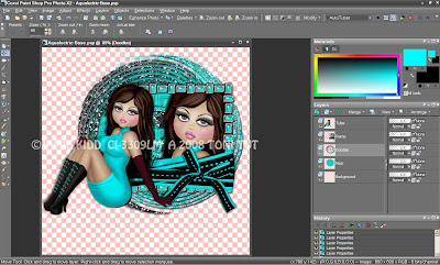
Once you're set, drop shadow both doodles, then activate the top doodle layer in your palette and Merge Down. Rename this layer to "Doodles." Move everything up if you need more room for your name, and give it a save while you're at it. Here's what we have now:
Next, we'll need a fan and a butterfly. I'm using Fan-01 and Butterfly-02 from Aqualectric, and I've resized both by 50%. Copy/paste or drag-n-drop to your canvas. Rename to "Butterfly" and "Fan" respectively in your palette. Butterfly can be positioned in your palette anywhere above Frame. Fan should be below Tube. The idea was to have her looking like she's waving the fan, but her hand wasn't quite in the right position for absolute realism. ;)
Now it's time for the Pick or Deform Tool, depending upon which version of PSP you're using. In X2, it's the white arrow icon located with the Move Tool, second from the top in your vertical toolbar. Pick is wonderful because you can access all of the warp modes, move, and even rotate, all without having to change tools or access any menus.
You'll notice there's a Mode and a bunch of number coordinates at the top of your horizontal toolbar. If you've mathematically figured your desired placement on the canvas, you can enter the numeric values and your element will position accordingly. As you move your element manually, you'll notice those values will change.
For now, we're more concerned with Mode. Mode has a dropdown you can use to change the mode you're currently in, or you can use your keyboard. Pick automatically defaults to the Scale mode when you activate it, which is a form of resizing. Open the dropdown menu and you'll see there are more Modes available, such as Shear, Perspective and Free. Shear is a curving mechanism, Perspective alters or gives dimension to an object. Free is a combination of all Modes.
Notice there are keyboard commands in parentheses next to each Mode in the dropdown. By using those keys on your keyboard, you can toggle Modes without having to pull down the menu each time. At the bottom of your workspace, on the left-hand side, there are tips/prompts which can help direct you through the Tool. Tried to give you a diagram of all that here:
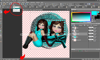
Let's start with Butterfly. You'll see there's a "box" around each item you select with the Pick Tool. Dragging the sides of the box inward or outward will scale the item respectively. If you look closely in the middle, there's a dot to mark the center. Hover over the center dot to activate the Move tool, left-click and drag to actually move your element.
Now look to the right of that center dot, and you'll see a a line extending over that ends in a little square, just like the squares on the sides of the box. Those little squares are called "Nodes." You'll see a pair of curved, white arrows which indicate rotation when you hover over the node at the end of that center line. Left-click and drag the node to rotate the butterfly into your desired position. I tried to take a screenshot to show you what the arrows looked like, but they didn't show up. Grrr! :P
Drop shadow your butterfly and duplicate the layer twice, for a total of three. Make Copy (2) of Butterfly active in your palette. Using the Pick Tool, Scale or Shear the butterfly inward, roughly 1/4 or 1/3 of the way in by pressing the appropriate keys (Shift and/or Control) while dragging the appropriate nodes with your mouse. Do the same thing on Copy of Butterfly, going about halfway to 2/3 of the way in. Leave original Butterfly alone. You should be able to see all three "staggered" butterfly layers when you're finished, and the space between each wing span should be fairly even, like this:
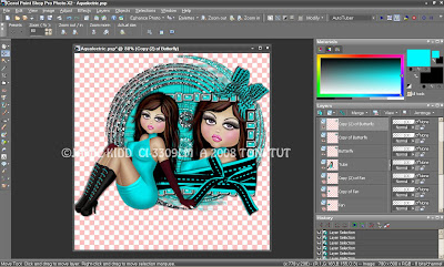
We're going to do the same thing on Fan. Using your Pick/Deform tool, rotate to your desired position. Drop shadow and duplicate twice, for a total of three Fan layers. Use the Pick/Deform tool again to shape the top two layers for the motion; leave your original Fan layer alone.
I wanted more of a downturn on the fan, but it wasn't being as cooperative as I'd have liked, so I went with more of a horizontal swing using the Perspective mode. You may have better luck than I did. LOL! Deforming by hand can require a little patience, so please don't give up. It just takes a bit of practice to get familiar with the tool and how it works with your mouse.
When you're finished deforming Fan, you might want to check the bottom of the handles to get them into alignment and further adjust from there. Hopefully your tube will hide anything you don't want to be seen, at the same time your Fan looks fairly smooth between layers. Save your working image so you won't have to do that again! Here's what we have now:
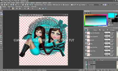
Resize as desired and add your artist copyright. Now it's name time. As I mentioned above, I'm using the font Riot Squad for mine. I used Black as the background/fill, and #00F9FF for the foreground/stroke. Right-click your text layer in the Layer palette and Rasterize it. Then duplicate twice, for a total of three.
Activate your Magic Wand and uncheck Contiguous in the horizontal Toolbar. Zoom in a little bit on your canvas and select any part of the aqua stroke. By unchecking Contiguous, you've instructed the Wand to select any and all pixels of that color, not just "connected" pixels, meaning you'll have the entire stroke area selected with just one click. This can be a big time saver sometimes! ;)
I've used DSB Flux Bright Noise to sparkle the aqua stroke on all three layers, but you can use PSP's Noise if you prefer. Click the word to mix DSB's Noise, or adjust the sliders for the amount of PSP noise before applying to each layer. This will vary the noise and give it motion when animated. Select None / de-select, then drop shadow all three layers when you're finished. I also duplicated Doodles twice and added noise to all three of those layers, as well. Sparkle anything you want to! Then save your image one last time. Time to go to AniShop!
First, close all layers in PSP except Background, Mask, Doodles, Frame, Fan, Tube, Butterfly, your copyright layer, and the first of your name layers. Copy Merged and paste into AniShop as a new animation.
Back to PSP. Close Doodles, Fan, Butterfly and the first name layer. Open Copy of Doodles, Copy of Fan, Copy of Butterfly and the Copy of your name layer. Copy Merged and paste into AniShop, behind current frame.
Back to PSP. Close Copy of Doodles, Copy of Fan, Copy of Butterfly and the Copy of Name layer. Open Copy (2) of Doodles, Copy (2) of Fan, Copy (2) of Butterfly and Copy (2) of Name. Copy Merged and paste into AniShop, behind current frame again.
Edit >> Select All or Control + A to select all frames. Right-click and select Frame Properties. Set the timing to 20.
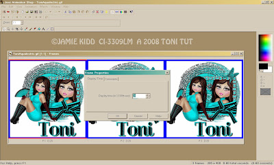
Run the Optimization Wizard (or The Annihilator, as I like to call it! LOL!), save as a .gif, and you're all finished! Yay!! Hope you've enjoyed the tutorial and will enjoy wearing your pretty new outfit. :)





No comments:
Post a Comment